Equilibrium
Economics concept #10

A quick recap: we have our blue demand curve, sloping downward, because more consumers are willing to buy something when the price is lower...and our red supply curve, sloping upward, because more producers are willing to sell something when the price is higher. Draw them together and X marks the spot.
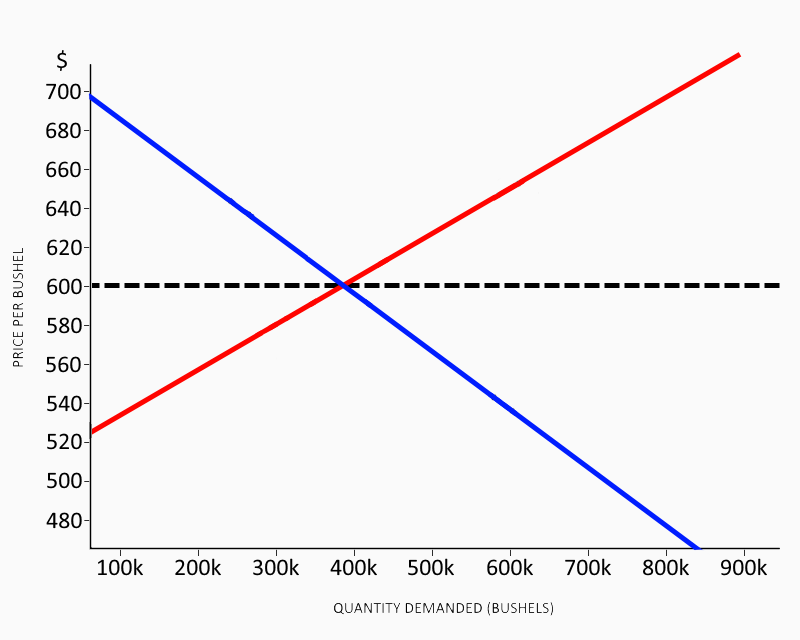
This spot is the market equilibrium: the price where the quantity producers as a whole are willing to sell is the same as the quantity consumers as a whole are willing to buy. Here, our equilibrium is 380,000 bushels of wheat traded (bought and sold) at $600 a bushel. The only producers who didn’t sell all of their wheat are the ones who wanted more than $600, and the only consumers who weren’t able to buy all the wheat they wanted were unwilling to pay $600. The horizontal dashed line extends the equilibrium price across the entire graph. This is because everyone who is buying and selling does so at the equilibrium price – there’s no reason for sellers to charge less, and if they charge more, their buyers will go to someone who is just charging the equilibrium price. In other words, the market price (the actual price that most trades are made at) and the equilibrium price are the same, at least at this moment.
This is of course simplified, like a physics illustration with no friction or air resistance. In reality, the preferences and goals of each participant in the market can and do change, which means nobody knows where the equilibrium is exactly.
That doesn’t mean the equilibrium is meaningless. The market price constantly moves toward equilibrium as sellers change the quantities they produce, or enter and leave the market, based on buyers’ willingness to pay enough to make them profitable. The market price and equilibrium price don’t stay exactly the same, because the equilibrium keeps shifting, but it constantly draws the market price toward it like a magnet.
WARNING: MATH AHEAD
Keeping in mind that what we’re looking at here is a simplified example instead of a messy reality, let’s break down what exactly the graph tells us. I’m using straight lines for the supply and demand curves to simplify things. There’s no reason to expect them to be straight lines in reality, but also no reason they can’t be, so that’s fair. I’m using wheat for the example because it’s a commodity. That is, every seller is offering (and every buyer is seeking) basically the same thing. Wheat is just wheat. Goods that are not commodities, like furniture and motor vehicles, can be differentiated – distinguished from each other by having different features or capabilities.
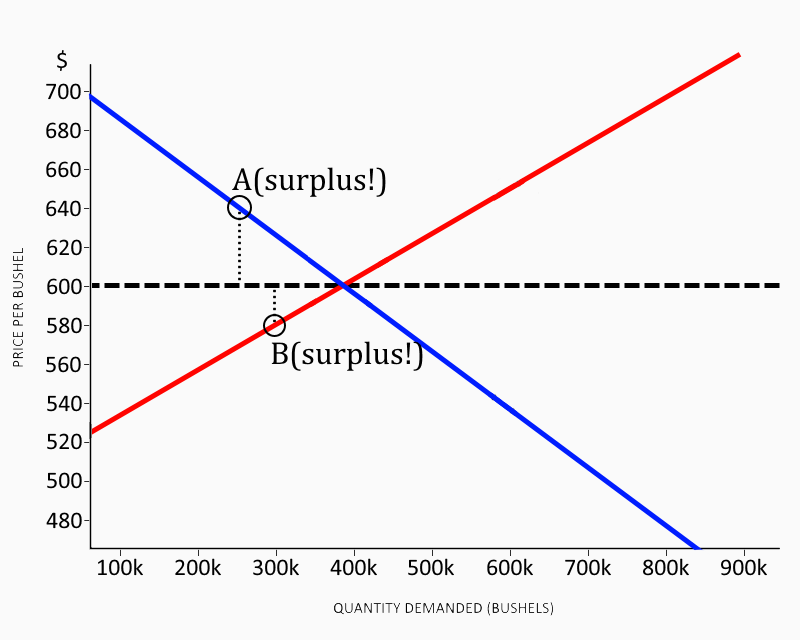
The buyers represented at “A” were willing to pay $640 a bushel, but only paid the equilibrium price of $600 – an economic surplus of $40 a bushel. Similarly, the sellers represented at “B” would have sold for $580 a bushel, but instead got the same $600 a bushel, for an economic surplus of $20 a bushel. The buyers and sellers close to the equilibrium point may have been ambivalent about the trade, but the vast majority of traders saw an economic surplus.
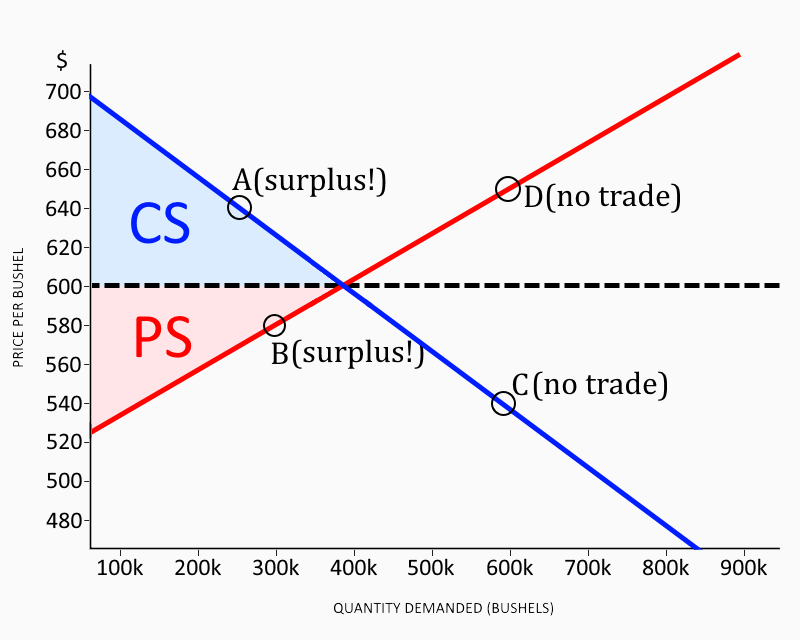
The buyers at “C” were only willing to pay $540, which sellers weren’t willing to accept because they could sell at the $600 market price. The sellers at “D” were asking $650, which buyers weren’t willing to pay because they could buy at the $600 market price. That means no trades, and no economic surplus, for either of those groups.
We can calculate the total producer surplus and consumer surplus simply by finding the areas of the triangles marked PS and CS. That’s 1/2 times the base (quantity traded) times the height (maximum surplus). It comes out to about $34.2 million, since the equilibrium is 380,000 bushels with a maximum surplus of $180 a bushel (the difference between $520 and $700 - the far left of the graph where it reaches a quantity of zero is missing and I don’t want to redo it, sorry). Of that surplus, producers got $15.2 million and consumers got $19 million. The details and amounts vary from one product to the next, of course, and in real life we never know exactly what the graph looks like, but this is the actual outcome of a free market in any commodity. Something similar happens with goods that can be differentiated, but they can’t be shown on a single graph – each product would require a separate supply curve and demand curve, which would get messy very quickly.